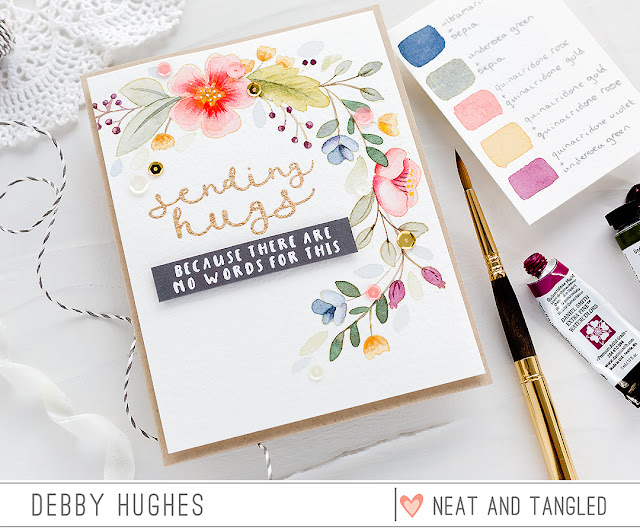
Hello, Debby here today and I thought I'd share my recent experiences of thinking more about the colour palette I use on a card. I must admit that as often as not I reach for a favourite colour and just start and then halfway through I get stuck as to what other colours to use. I find this, often when colouring a multi flower arrangement, where I start with a favourite pinky peach colour and then get a bit stumped further along. So for this card using the beautiful Friendly Florals set I purposely set out at the beginning to choose my colours carefully before I actually started. In the end, I created a colour swatch with the colours I planned to use to help me stay on plan. I suggest keeping a Pinterest board of colour combinations you find inspiring and then you've always got a wealth of possibilities when you sit down to create. Here's my Pinterest Colour board.
So with a colour scheme in mind, I sat down to make this card. I stamped a range of images from the Friendly Florals set in Antique Linen Distress Ink on Arches Cold Pressed watercolour card and then used Daniel Smith watercolours to paint. I used dilute mixes of colours to give the muted colour scheme I was after and to ensure the colours went well together I used a few of the same colours in the mixes. So for the blue flowers, I used Ultramarine Blue mixed with Sepia, but I also used Sepia when mixing with Undersea Green for the leaves. I used Undersea Green again with Quinacridone Violet to dull down the purple mixture a little. For the large pinky peach flowers I used Quinacridone Rose with a touch of Quinacridone Gold but equally for the rich yellow flowers I used the same two paints but this time more Quinacridone Gold than Quinacridone Rose. After I finished painting, I used a Faber Castell pencil and a white gel pen to add details to the flower centres.
For the sentiment, I stamped a greeting from the No Words set in Clear Embossing Ink, sprinkled with Antique Gold embossing powder and heat set. I also stamped a coordinating sentiment from the No Words set on Slate card and white heat embossed before trimming to a banner and adding with foam adhesive below the gold embossed sentiment. I mounted the finished panel on a Desert Storm card base and accented with Pretty In Pink sequins.
I'm certainly going to keep creating swatches, be it watercolour or any other media, before starting a card, and I'm planning on keeping the swatches too for future reference.
Thanks for joining me today and I'll see you next time.


Happens with me lot, starting with fav color and having no idea what to use next ! Thank you for sharing your idea.Your card has turned out so beautiful !
ReplyDeleteSimply stunning Debby. I do this as well, what a great tutorial and awesome tips on the mixing of your colours. I love the idea of keeping a Pinterest board for colour combos too, heaven knows I could use that!
ReplyDeleteBeautiful card! :)
ReplyDeleteSo very pretty!!
ReplyDeleteLovely and can be used anytime someone is hurting.
ReplyDelete