Hello! This is
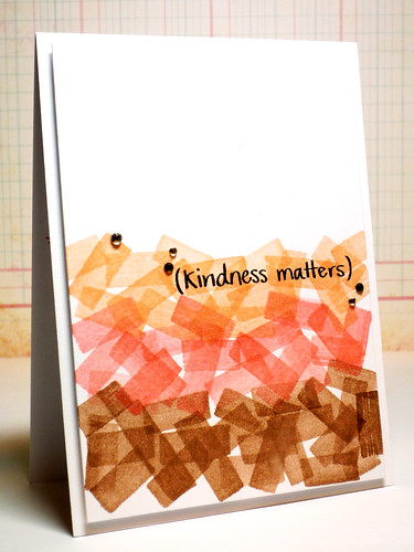
Pamela here and today, I made a simple card with my favorite stamp set from last release:
Kindness Matters.
I've been obsessed with watercoloring with ink pads these days to create a neat looking background base. I really like this combination of colors to create a gradient effect!
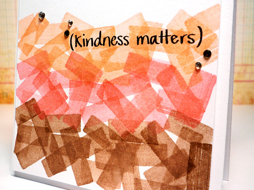
Here's a close up of the watercoloring paired up with a simple sentiment in black. Don't they look like washi tape?
Scroll down to see how the background was done. It was both quick and easy!
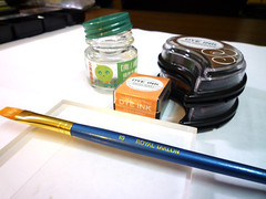 |
First, collect your supplies:
1. Clear Acrylic Block
2. Small bottle of water (that bottle was where my Marimo comes in. It now lives in a little aquarium!)
3. Paintbrush
4. Dye Ink: Dark Chocolate, Berry Sorbet, Melon Berry |
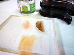 |
» Apply the ink onto the clear block.
*TIP* Put white paper underneath the block so you can see the ink. |
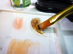 |
» Dip your brush into some water and put it on the clear block.
» Mix some water with the dye ink. Don't mix too much water as the colors will be lighter. |
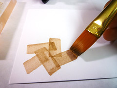 |
» Brush the ink onto the cardstock.
» Different brushes will yield different strokes. |
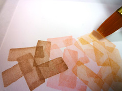 |
» Continue applying the ink in various directions, overlapping each stroke to create a gradient effect. |
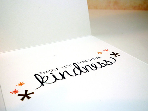
On the inside, I stamped a sentiment from the same stamp set and decorated it with stars from various stamp sets. I love these decorative stars as they are very versatile and perfect for decorating the inside!
That's all from me today!
-- pamela
loading..




BEAUTIFUL! Thanks for the tut!
ReplyDeleteA amazing!!!
ReplyDeleteBeautiful effect! I am so glad you did this tutorial! After seeing the first card in your blog, I kept wondering how you did this background. I will def give it a try :)
ReplyDeleteThat is so great. Love the effect.
ReplyDeleteVery pretty card. Such a clever technique. At first I thought you'd just ripped a bunch of different pieces of washi tape.
ReplyDeleteBrilliant!! Thank you so much for sharing this idea.
ReplyDeleteComing here from Pamela's blog ... great technique! Thanks for showing us how it was done. Love the effect : )
ReplyDeleteYou are so artsy, Pamela! I can never get neat looking stuff with free hand drawing lol Envy your talent!
ReplyDeleteGorgeous! It really does look like tape, but of course it's much more versatile (and matches your ink perfectly, because of course it is your ink!)
ReplyDeleteThat is a great technique!! Gorgeous card!
ReplyDeleteAWESOME! so want to try this! thanks for the brilliant idea!
ReplyDeleteHow COOL is this, Pamela!! Love the gradient of colors!
ReplyDelete